I recently moved back to New Hampshire after a four year stint in Massachusetts (don’t judge me!) and have been doing a lot of projects. By far, the most fun has been painting a mural!
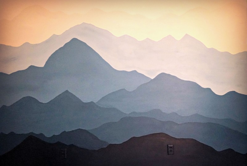
I have almost no artistic skills so I enlisted my sister to help me out. After completing this project, anyone can do it if you plan it out right. The first thing we did is sketch out a plan. Think of your favorite views for inspiration. In New Hampshire’s White Mountains we have a large concentration of peaks ranging up to just over 6,000 feet that comprise of gentle slopes, steep ledges, cliffs, and ridge lines. This shaped the overall design. I had seen this idea on Pinterest and it was intricately planned out. Th great thing about painting mountain vistas is that it’s just lines and you can make changes as you go. Be flexible and have fun!
For the colors I wanted a gradient look so I purchased Sherwin Williams Blue Midnight, Sherwin Williams Talc Powder, Valspar Filtered Shade, and white (just an untinted quart to mix together. A quart in each color was plenty for a smaller wall. My sister, Rachel tinted the colors and filled in the sketch she made on paper. We didn’t use grey for the sketch and we decided it would help to transition from blue to cream so we took note.
After we were happy with the design and colors, we brought it to the wall. Make sure the wall you plan on painting has been cleaned and any holes have been filled in. The wall color was really light so we were able to paint right over it. Use the photo as a reference but don’t go crazy over making it exactly the same. I found it helpful to put squares of painter’s tape for each layer before drawing. Have some layers go from wall to wall while others are smaller. Make sure to have enough variety as well.
Once you are happy with the design, begin painting! The bottom layer was not mixed with any other color so that was very straightforward. We painted the outlet covers as well to mask them.
After the first layer we began tinting the blue with grey. I measured out the grey in a solo cup and poured it into a bowl. We would add an equal amount of grey into the bowl for the next few layers to lighten it up.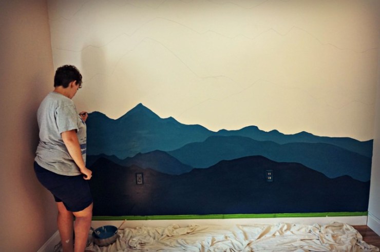
After the fifth layer we mixed equal parts of grey and cream into the bowl.
What worked the best for us was to have one person cutting the edges and the other filling the large areas. It’s easy to use a regular paintbrush to paint the bottom and top edges of each layer as the peaks can change shape a bit if you make a mistake. If the edge isn’t solid or you added too much paint, you can just bring it down a little more.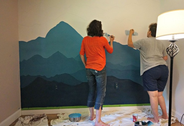
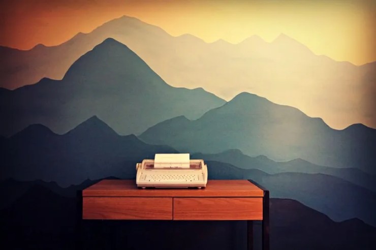
The other three walls will be painted an airy blue-grey to tie the whole room together. If you enjoyed this project you may want to learn how to make some pretty awesome mountain coasters. They make great gifts!
Last modified: September 1, 2017

That looks really fantastic, Allison. You think it might be a little easier to paint top down, applying the light colors first? It’s easier to cover light colors with dark, and if I drip it won’t matter.
I painted my home office a yellow-cream color to make it feel upbeat, but a mountain mural would feel even better. Thanks for the idea.
-Kimball
TrailsNH.com
I actually didn’t have drip issues which was good and once the bottom color was dry, the color above would actually cover it. I thought about doing top down, but I wanted to add a little more dimension with added creams and greys to the blue. For me, going lighter and adjusting as I went worked the best, but you should get awesome results going top bottom.
Too funny-I just did this in my boys’ room this summer! They are 4K enthusiasts, and we did a sort of amalgam of views from Passaconaway, Pierce, and Cannon-the only three they’ve done so far. But next week, the weather may give us a window for Washington. They are psyched. Enjoy your mural!
That’s awesome! I’m sure it motivates them. Good luck on your hike up Washington. They’ll never forget that one!
I love this! Can you tell me what gray you used?
I wish I could! I used leftover grey from painting another room that I actually mixed from another grey… real helpful, huh? 🙂 I would pick a grey that doesn’t have much brown in it and more of a blue undertone.
Im looking at doing this in my Baby’s Nursery, however I’m a little confused with the grey and cream adding.. start with midnight blue for the 1st bottom layer, then add a light grey in increments to the next few layers, and then start adding a beige/cream to the top layers? hope that makes sense? Yours looks so beautiful!